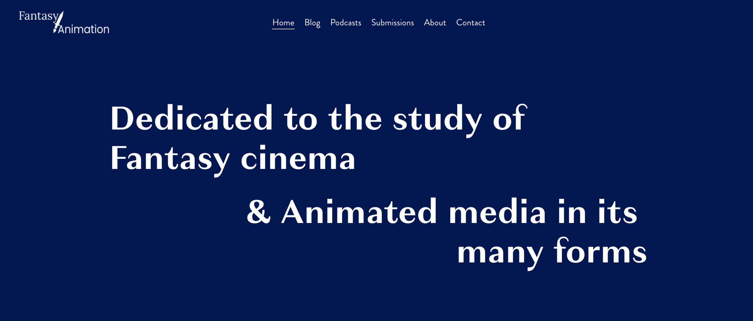
Fantasy|Animation is a website that engages academically with animation and fantasy media. Following the book Fantasy/Animation edited by Christopher Holliday and Alex Sergeant in 2018, the website hosts regular interdisciplinary analysis of fantasy animated media in the form of blog posts and podcasts.
What was the problem?
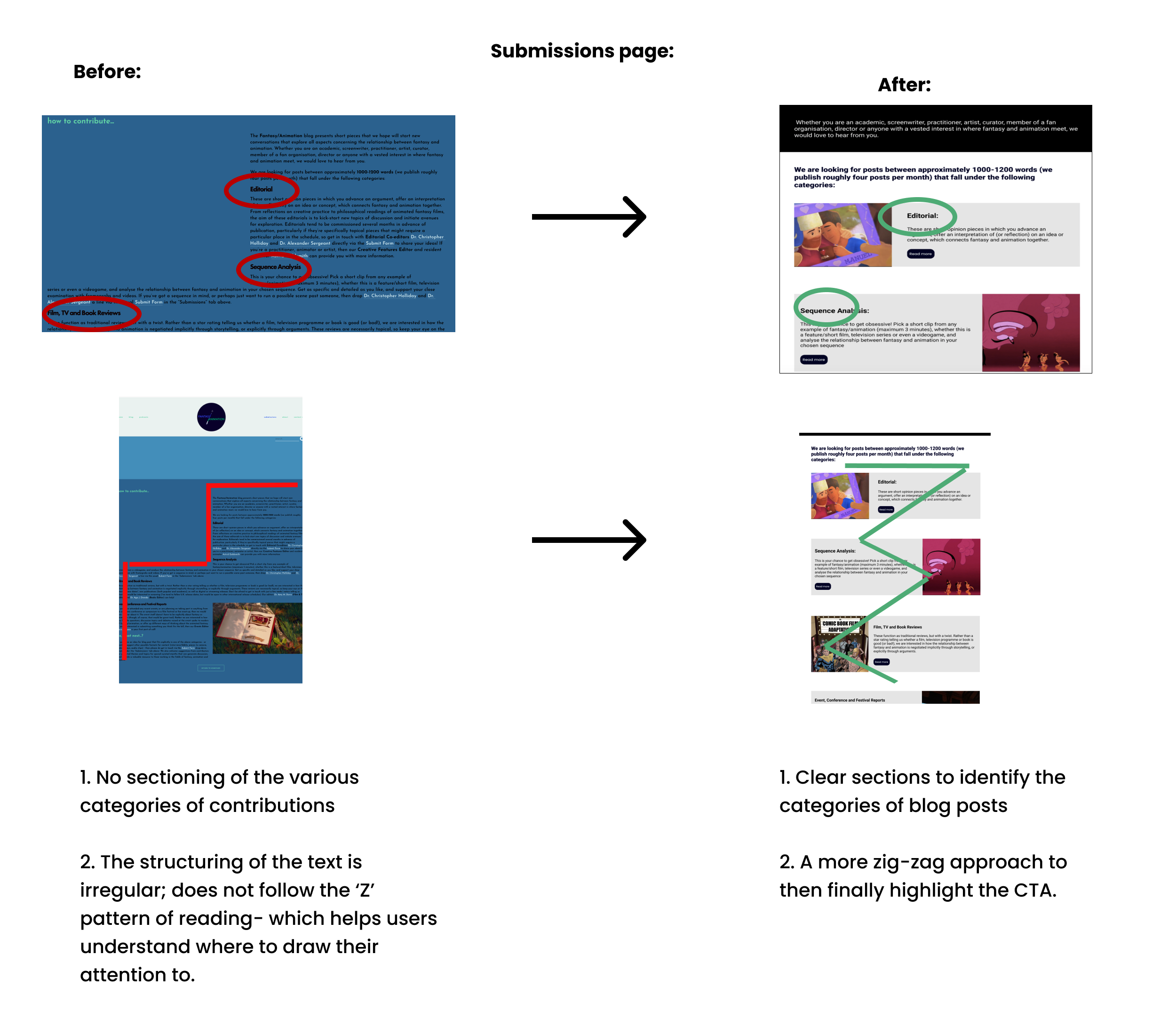
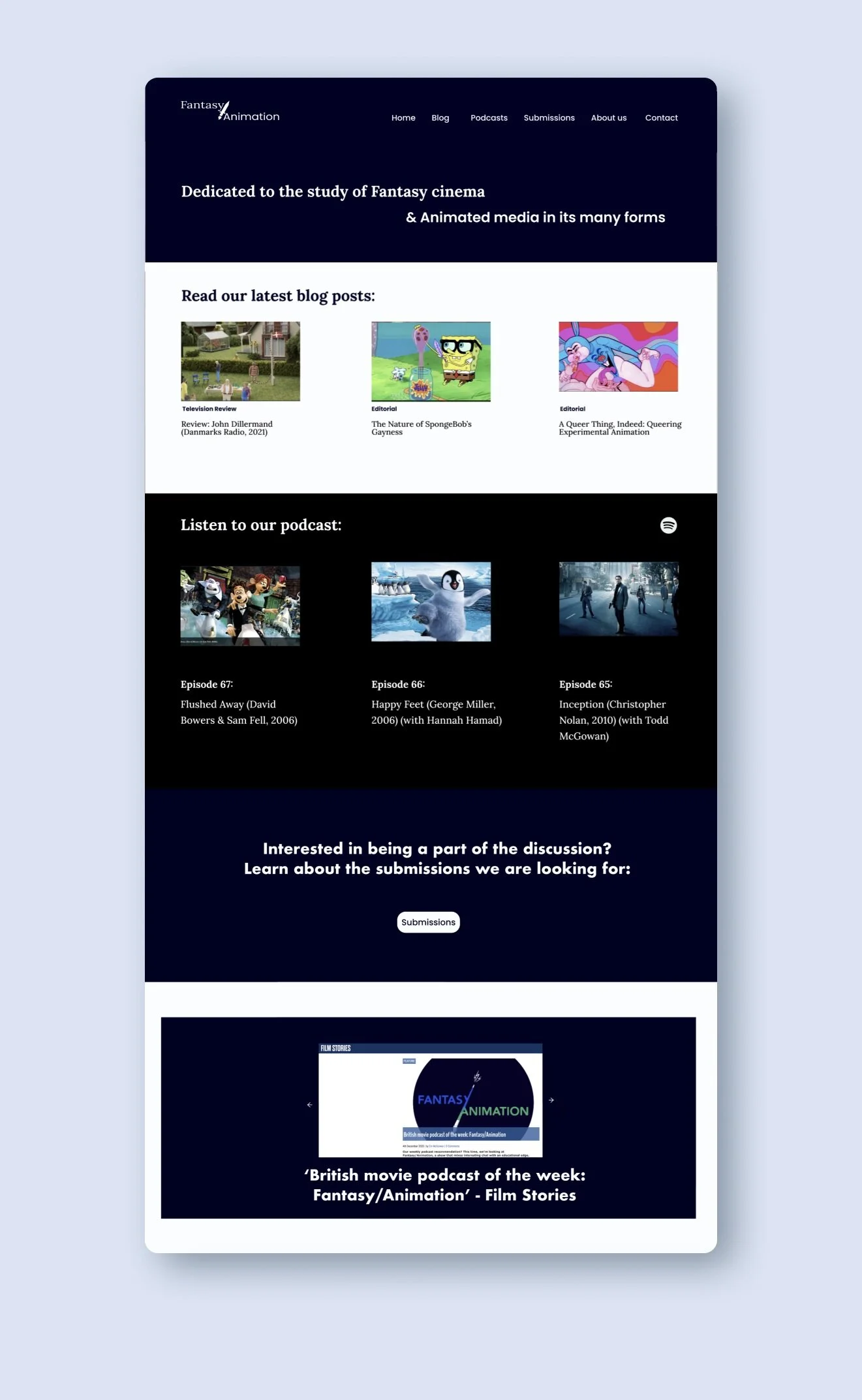
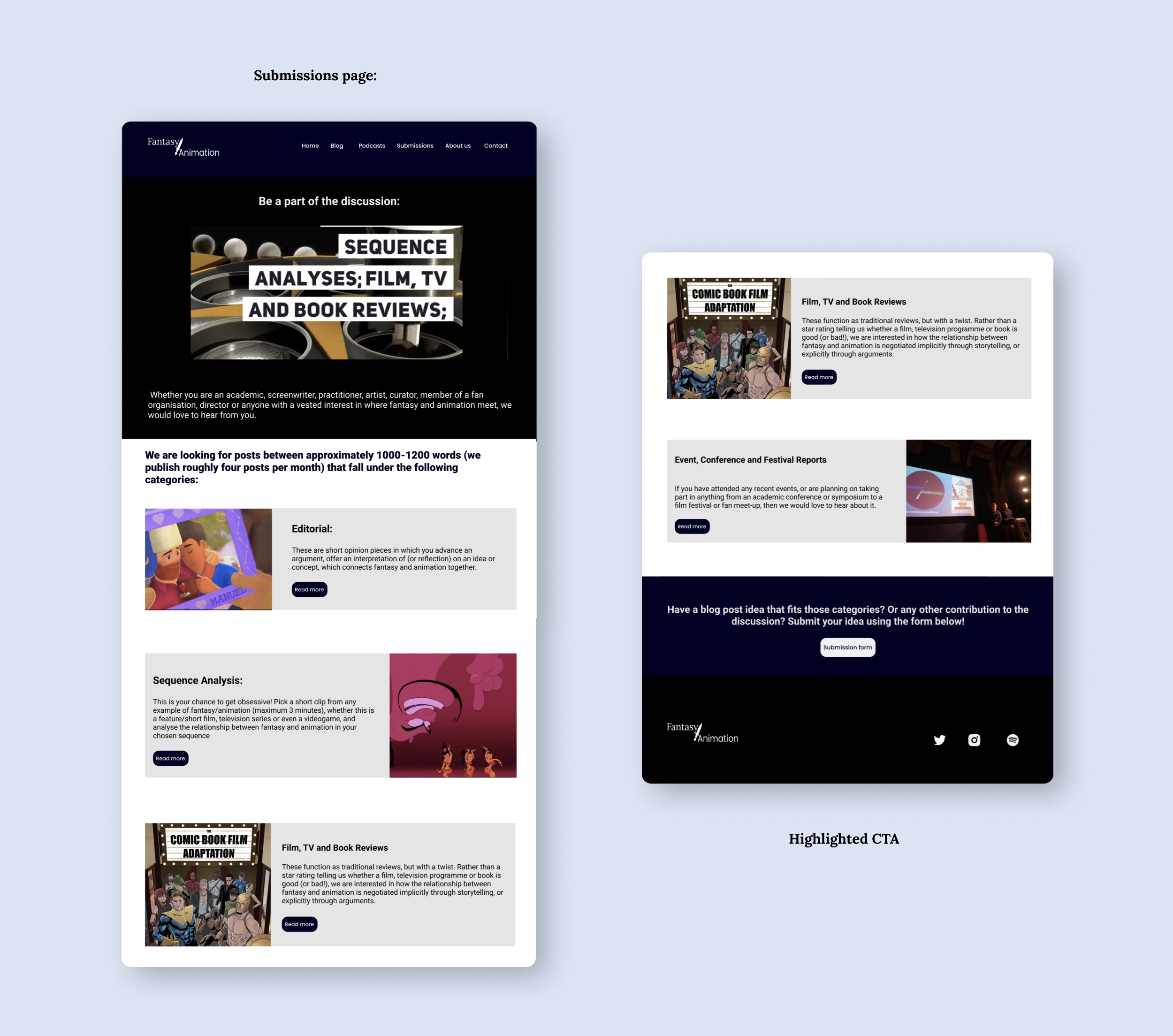
When attempting to submit a blog post idea, a clustered home page made navigation difficult, and the unclear categorisation of types of blog posts made it difficult to choose a category of submission.
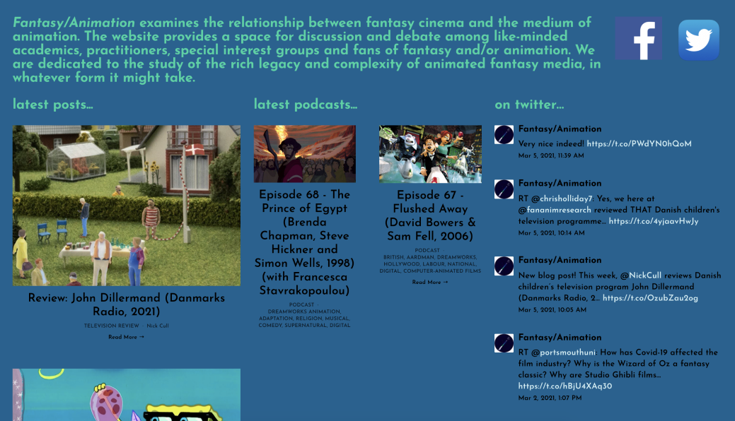
Clustered home page.
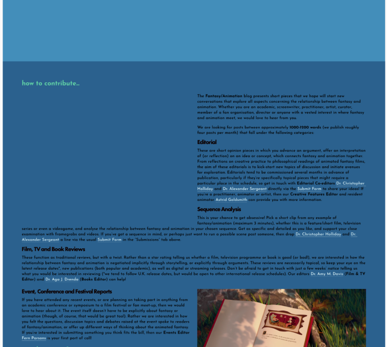
Unorganised categories of submissions
Goals:
To free up the home page and to showcase the blog and podcasts more clearly using different sections
Categorising different blog post submission using sections
My role:
UX Design
UI Design
This redesign proposal of the website came from the opportunity of studying Dr. Christopher Holliday's module on Animation. I proposed to redesign the home page, as well as the submissions page.
Constraints:
Time: 1 week
Platform: Hosting on Squarespace, designed on Figma
Since there are academic references and sponsorships, I will present the screens without said advertising and sponsorship
Summary:
Research:
Understanding the user base by looking at the contributors of the blog posts.
Created a user persona of one such contributor.
Mapped out the user flow to submit a blog post idea.
Redesign:
Used low fidelity wireframes
Kept comparing the wireframes to the existing website.
Final Edits:
Compared the changes made to the high-fidelity wireframes to the existing site.
Created a trial website on SquareSpace for executing the high fidelity wireframes.
Research:
Understanding the user base and creating a persona
Mapped out the user flow navigating from ‘Home’ to ‘Submissions"‘
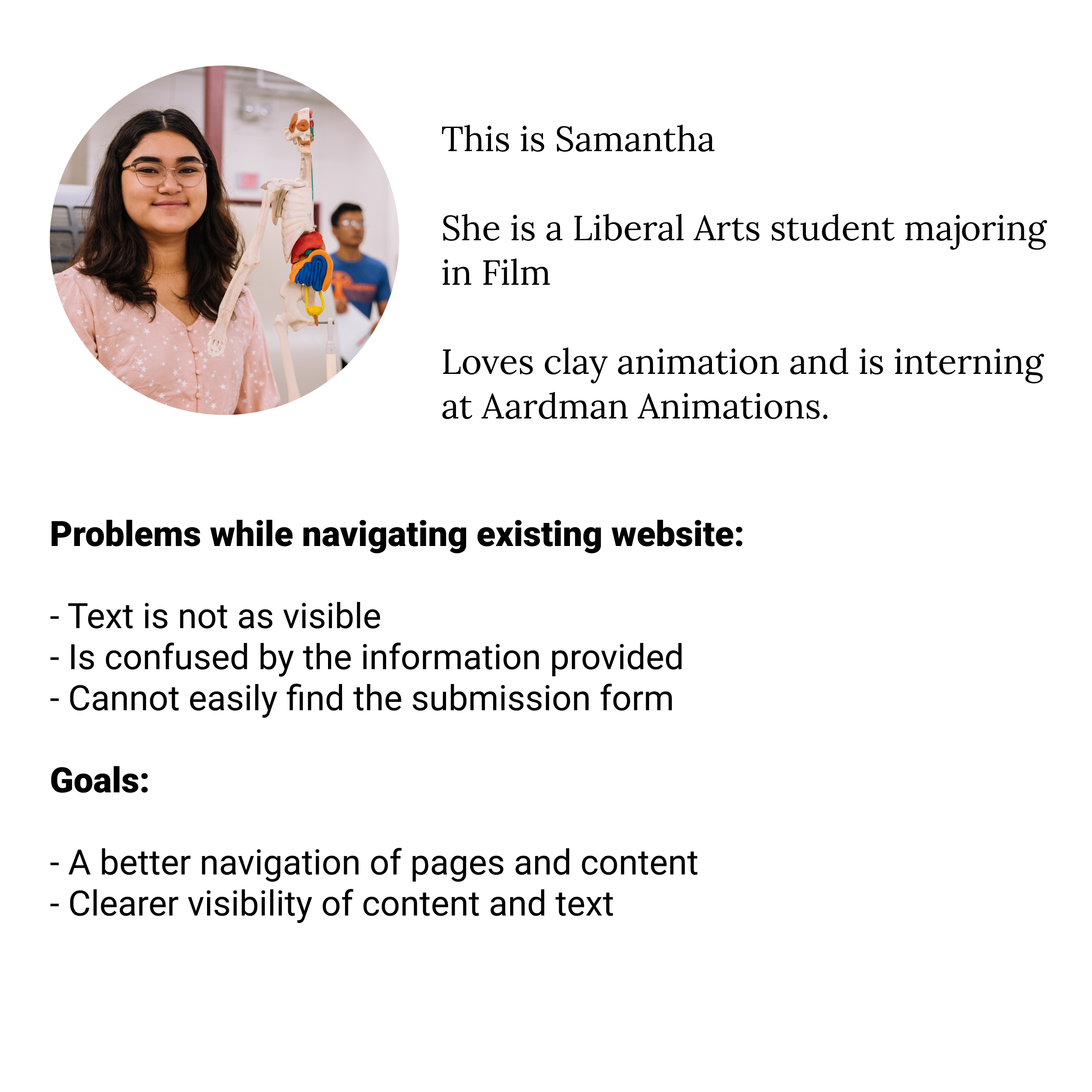
1. Understanding the user base and creating a persona:
‘Whether you are an academic, screenwriter, practitioner, artist, curator, member of a fan organisation, director or anyone with a vested interest in where fantasy and animation meet, we would love to hear from you’
— from fantasy-animation.org
We can categorise the user base into 3 main categories:
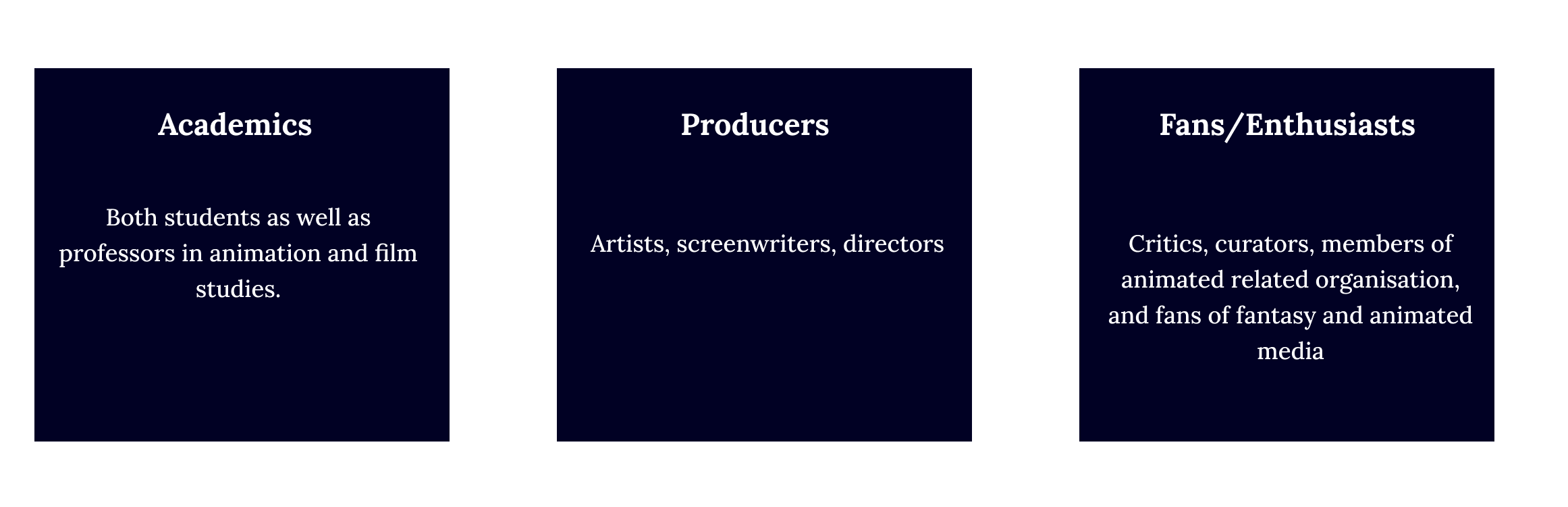
Focusing on the Academic users, as they were the group with most contributions on the website in the form of blog posts, I created the following persona:
2. User Flow:
Using the above persona, we navigate Samantha’s journey through the website to submit a blog post idea:
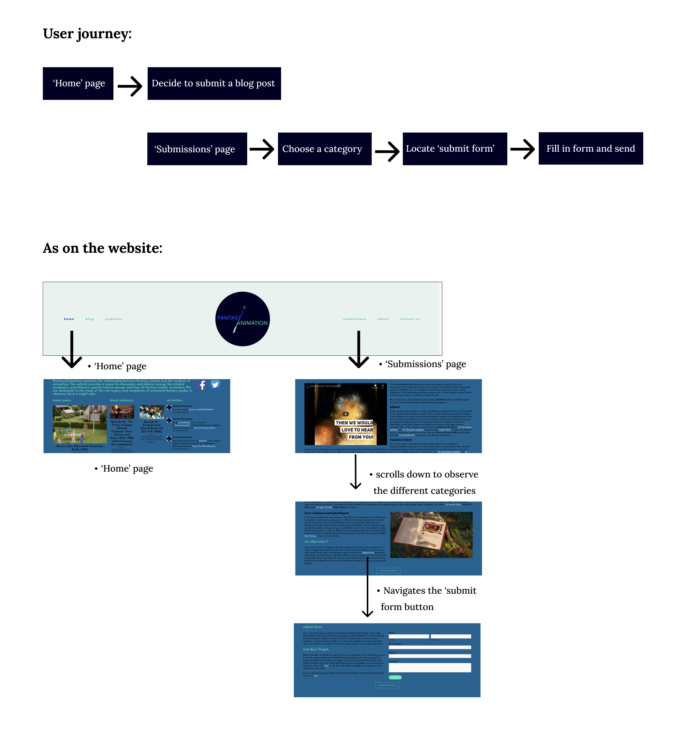
Once the user flow was established, I went ahead with low- fidelity wireframes.
Redesign:
Designing low-fidelity wireframes to mark out content
Edits made: comparing it with the existing website
Low-fidelity wireframes:
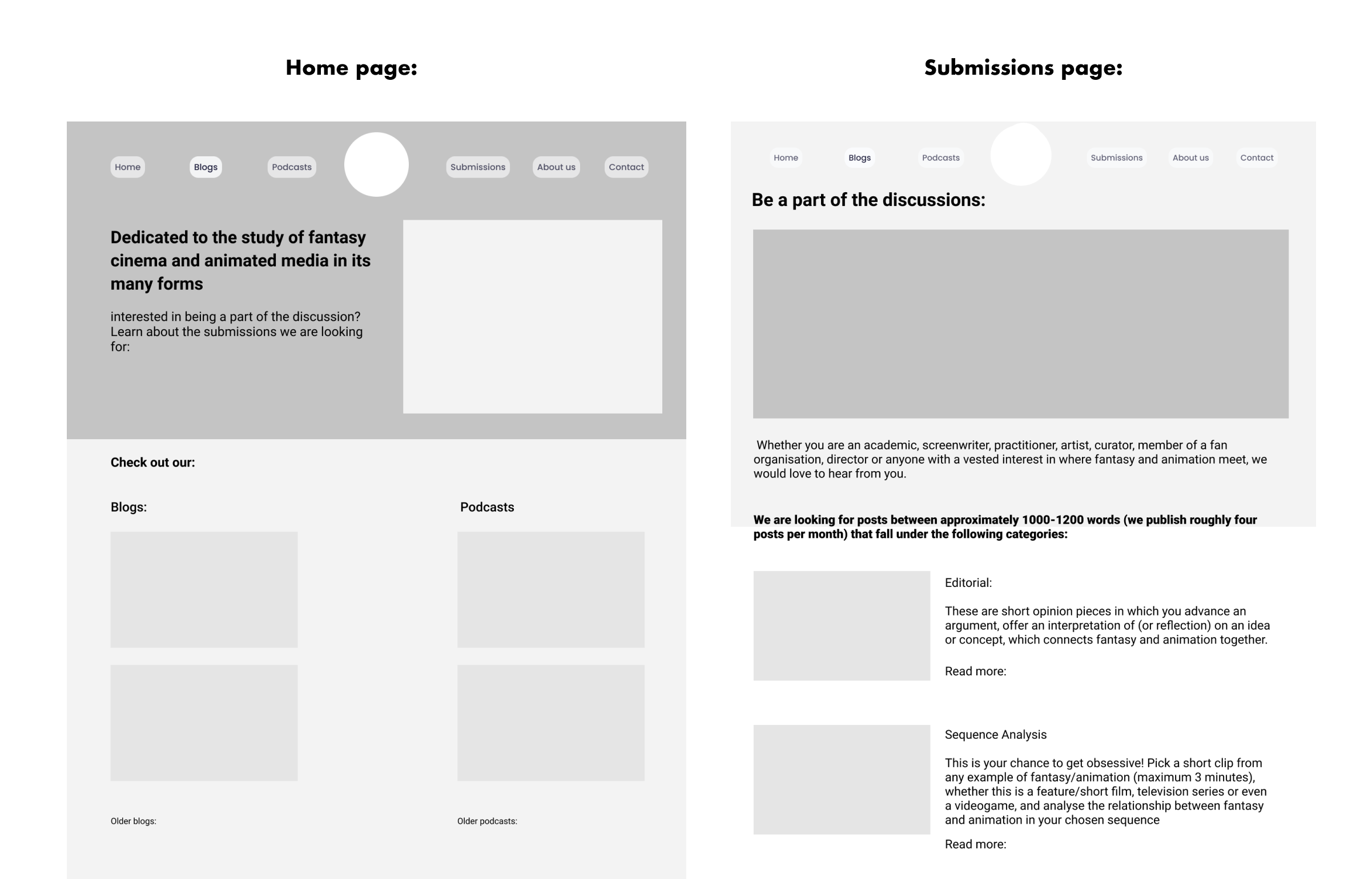
Started to get an idea of the layout of posts for the ‘home’ page
Sectioned the categories of blog post submissions in the ‘submissions page’
Using this, I applied these sections onto a trial website using Squarespace, the same platform of the existing website.
2. Edits made towards the final redesign
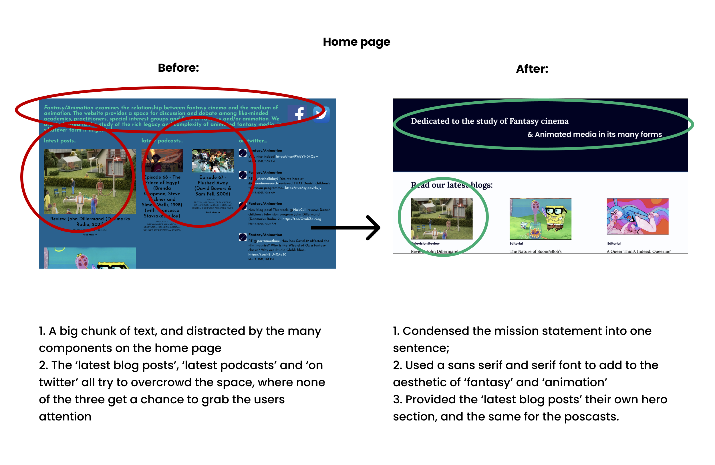
Implementation on Squarespace:
After applying the design onto a trial Squarespace website, I compared the navigation between the existing website and the redesigned one:
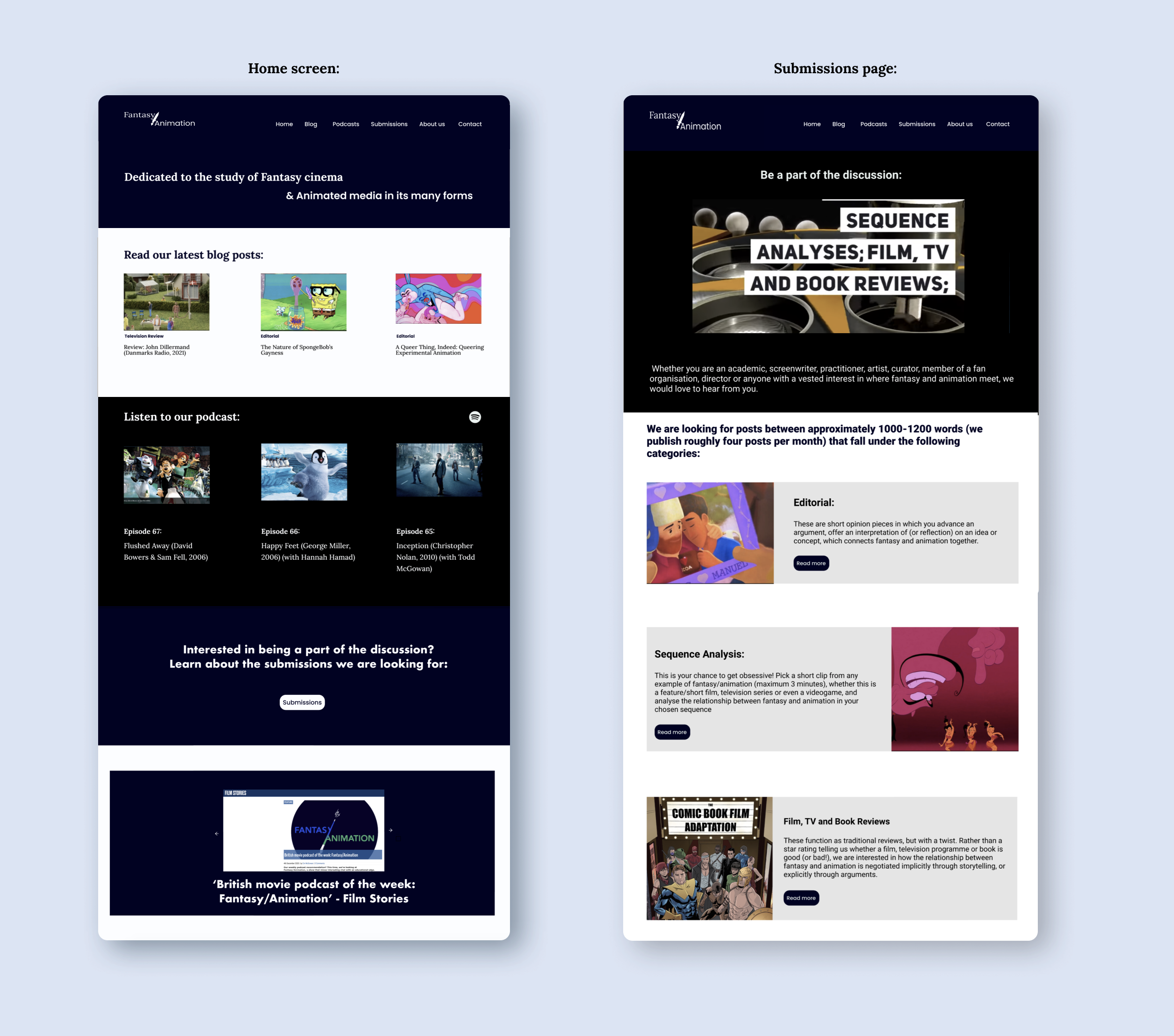
Existing Website:
Redesigned on Squarespace:
Final Redesign:

Reflection:
This was a really interesting case study, as the existing website is one that I have used for research. Working with Squarespace made me understand that there are platform constraints, such as lack of fonts and colours, and that were compromises that I had to make, but I also got to use custom CSS codes to enhance certain features. If given the opportunity to redesign the website, I would be delighted.