Motorola's smartphones are renowned for their integration of stock Android, providing users with extensive customisation options through Moto's ‘My UX’ interface. To fully leverage the Android 12 experience, we recognised the necessity of creating a dedicated page to showcase the vast possibilities offered by My UX, complemented by Android 12.
How can we create excitement and engagement around Motorola’s unique software features, combined with new Android updates?
To combine the 2 existing pages of Android 11 and MyUX to create a landing page with information regarding Motorola’s additional layer of customization that allows for the best android 12 experience.
To showcase these features to excite and inform the user.
Goal:
Role:
Worked with the UX Designer, Global Digital Design Manager as well as the Copy Team.
Research: Competitive analysis, Usability testing (Userzoom go)
Design - Wireframes and mockups - used Adobe XD, AfterEffects for animations and Axure for prototypes and usability testing
Time:
4 months
Overview:
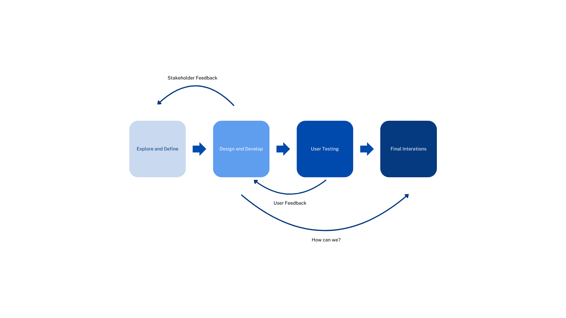
Exploring and Defining
-
Existing Page Analysis and Competitive Analysis
-
Item description
-
Started to figure out prioritisation and sketch out wireframes
Designing and User testing
-
Creating low fidelity mockups for feedback;
-
Iterating on the Marketing and Copy Team’s feedback;
-
Conducted an unmoderated usability test on UserZoomGo with the prototype of the page
Feedack and Iterations
-
Analysing the usability test responses to restructure goals
-
Final round of iterations and feedback
Exploring and Defining
Exploratory Research:
I had to first familiarise myself on what ‘MyUX’ was the different features available as per the last android update; I made a few notes on the page, but there was one key observation:
Not enough visuals to communicate the features.

To understand what was out there, I looked at 3 different competitors to analyse their software landing pages;
Competitive Research:
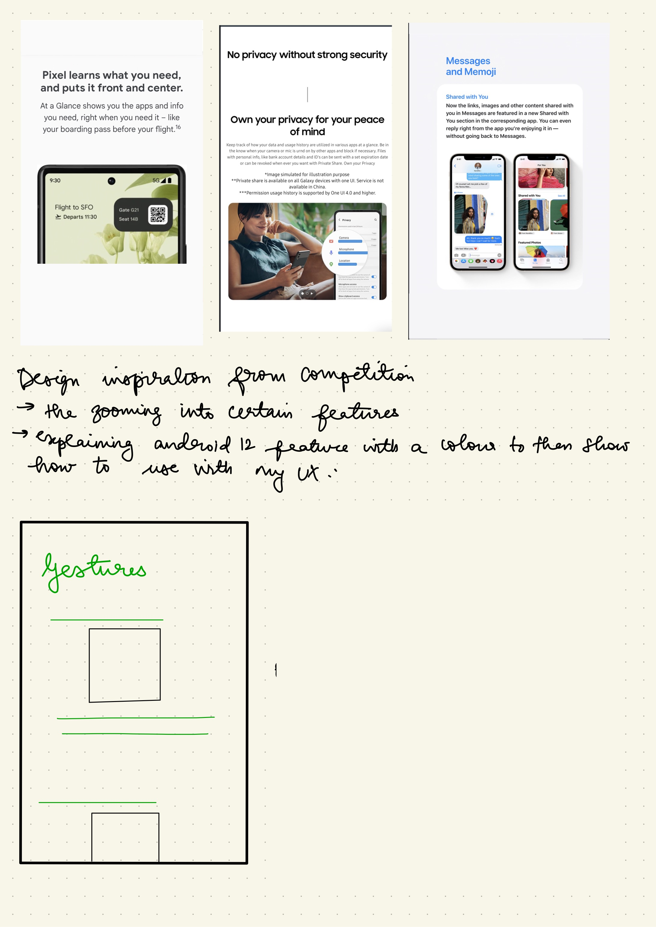
While this competitive research was more geared towards observation on content placement and to get inspired by how they’ve communicated their content, it also bought up a few questions to be remembered when designing this page:
How functional are these designs on different screens?
How to make sure we communicate features for new and returning users?
How to accommodate for new features during Android upgrades?
Should there be a CTA? What would it be?
Most of this feedback and questions also made their way into the wireframe sketching process:
Wireframe Sketches:
I prefer to sketch out and annotate my ideas and thoughts like this as it gives me a reference to any points I make. For example in this ideation wireframe sketch:
Gradients and parallax scrolling were very popular trends during the early 2020s (given that we are near the mid 2020s);
I was also trying to understand how it would look in an entire page without breaking into screens; which was an error on my part as we dive into the user research;

Since this wireframe was meant to provide a content layout of sorts, the question of how it would look on desktop vs phone screen was also something to be thought about;
Design and Develop:
Low-fidelity Mockups:
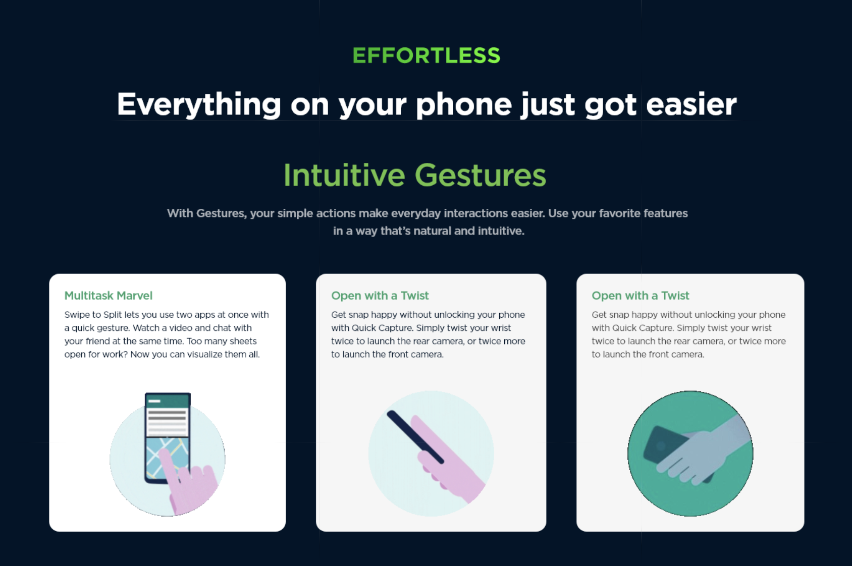
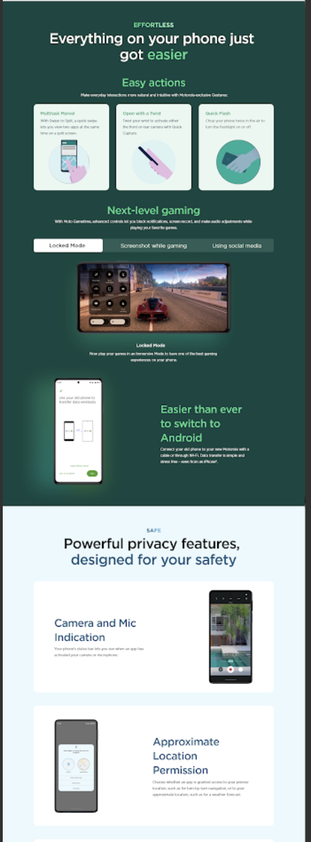
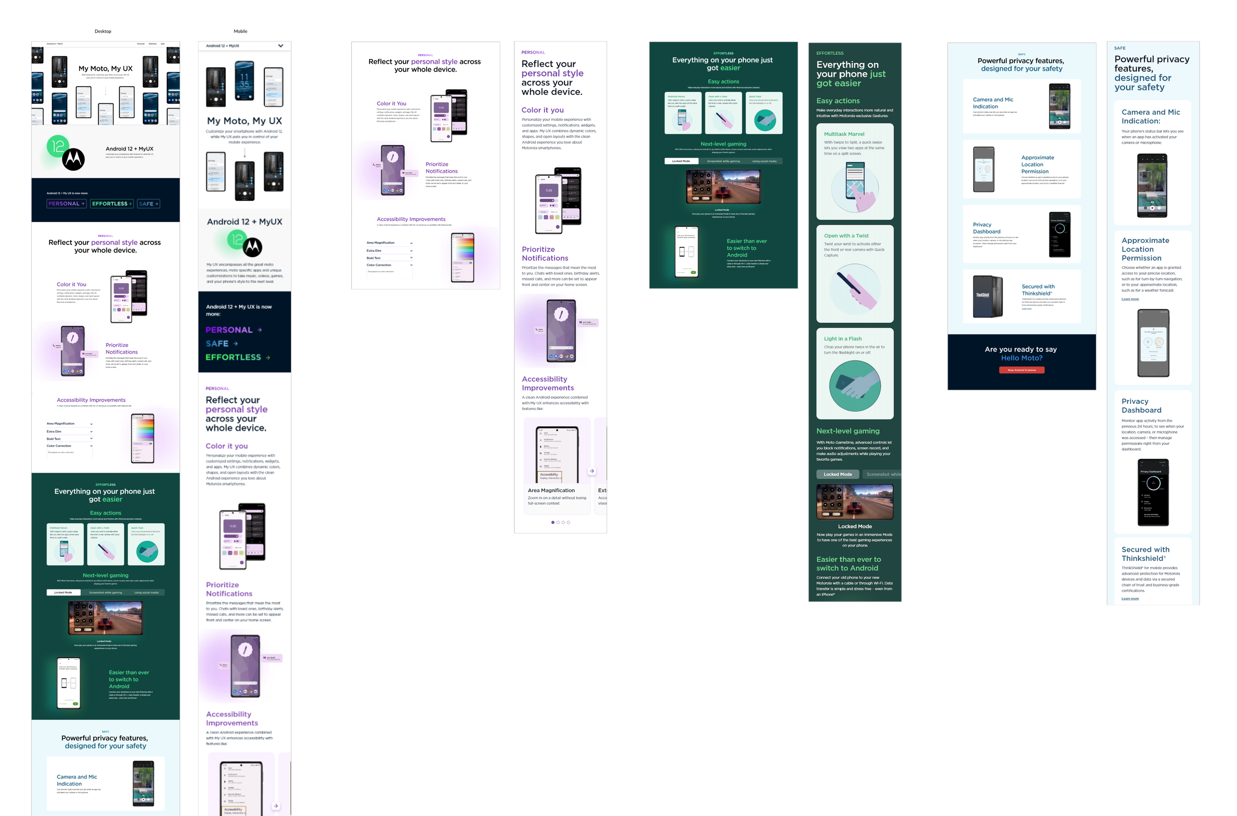
After I received confirmation that the three features this page would have for this software update was ‘Personal’, ‘Safe’ and ‘Effortless’, I wanted to group the features with colours would explain what those features would signify;
Exploring through sketches:

Using colours like:
A bright yellow/orange to convey creativity and the customisation of visual elemets;
Blue to provide a clear and transparent background to feature the safety and privacy settings available;
Highlighting the uniqueness of Motorola’s standout actions, purple creates an effortless experience;
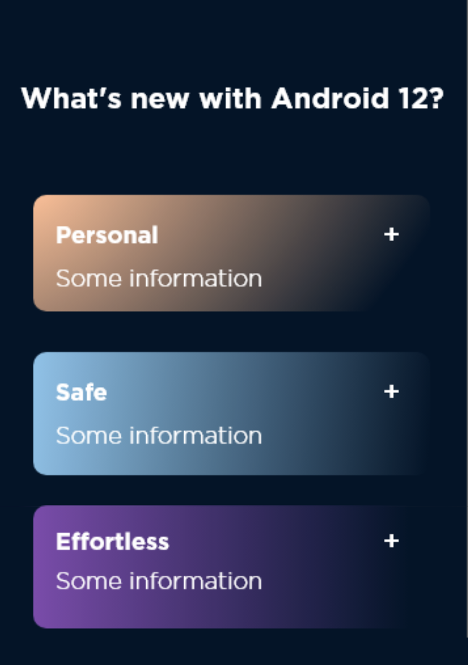
Before User Testing, I received feedback on the colours of the features - that it did not compliment the existing colour palette of Motorola; therefore:
Before:

The purple for ‘Personal’ signifies a more sophisticated and uniqueness that the user possesses; while the green for ‘Effortless’ creates a calm, relaxing association tied to the ease of features provided by Motorola.
After:

User Testing:
An Unmoderated Qualitative Usability Testing of high fidelity prototypes allowed us to test out the copy, layout and visual interactions on the page, to make sure they aligned with the business goals of MyUX being communicated effectively and left the users more informed and excited.
Goals:
Associability of content: to have the users find, associate and link certain words to certain features;
Functionality of the interactions: to have users test out the interactions (Accessibility section, Gaming section);
To get an overall impression of the usability and visual design of the page;
5 Users, both on desktop and mobile, through UserZoomGo went through a screener survey, pre-task question, tasks, post-task questions and post-test questions.
A quick note:
The first two tasks helped us to test out certain interactive and visual features on the page as seen in the high fidelity screens, while tasks 3-5 helped test out the user’s ability to discover and find certain features with associating words to them-Since this was one of my first conducting UX designer with an established organisation, I was met with the constant question of balancing the amount of information to provide with certain tasks and to allow users just enough information on the tasks to really help test the page.
-
Are you a current android user?
Are you aware of Motorola smartphones?
Do you own a Motorola smartphone?
Have you used any customisation features on your motorola smartphone?
(Why these questions: To gauge just how much the users know about Android 12 and Motorola, to set context without giving too much information beforehand. If not, to test whether the page will help cater to users who do not know much about android 12 and myux? And if they do have more information already, to see if the information is still findable and understandable)
-
How familiar are you with Android 12? (Not familiar, Somewhat familiar, very familiar)
How familiar are you with Motorola’s MyUX feature? (Not familiar, Somewhat familiar, very familiar)
(Asking about their familiarity would then later help us understand if the page helped make these topics more familiar to the user)
-
Make your way to the ‘Personal’ section of the page.
Think out loud to understand what the feature ‘Area Magnification’ is (On desktop)
Think out loud and tell us what you understand by the ‘Greyscale’ Feature means in the Accessibility Improvements section (Mobile)
After Task Completion:
How easy was it to complete the task? Out of 1-5, being very difficult and 5 being very easy.
What was easy or difficult about getting to the content you wanted?
What can be improved?
-
Make your way to the ‘Effortless’ section of the page.
Think out loud and tell us what do you understand the feature ‘Screenshot while gaming’ means (On desktop and mobile)
After Task Completion:
How easy was it to complete the task? Out of 1-5, being very difficult and 5 being very easy.
What was easy or difficult about getting to the content you wanted?
What can be improved?
-
Task 3- Locate on the page where you can access an overview of app permissions.
Task 4: Locate on the page where you can change the visuals on your phone to your liking.
Task 5: Locate on the page where you can use specific motions to quickly access and use certain features on your phone- for example, lifting a Moto phone to unlock it.
After Task Completion:
What was easy or difficult about getting to the content you wanted?
What could have helped you discover this content better?
-
How much did the page help you with your understanding Android 12? (Not Helpful. Somewhat helpful, Very helpful)
What can be improved?
How much did the page help you understand MyUX's features to personalise and customise your phone? Not Helpful. Somewhat helpful, Very helpful
What can be improved?
Do you feel excited about Motorola smartphones after reading the features that Android 12 and MyUX offers?
Key Findings:
-
To generate excitement, GIFs and Videos were one of the main feedback points we received:
“It‘It would help to have the user imagine using these features in their lives”
“I think having a more visual experience within it would be more better with a GIF or videos to illustrate these features”
-
Users on the desktop interacted with the in page nav and found it useful to get to content: ‘the fact that I had multiple choices to get to the content’.
But on mobile, users suggested for a more comprehensive in page navigation: ‘add a drop-down menu listing all the features’ and ‘list what can be found in a section’
-
‘Show me more! What other interactions like these are there?’ and ‘show me more features that are included’
-
‘There are a lot of very innovative and sophisticated new features that are very cool to use’
It has great features where some of the other phones on Android 12 don’t provide’
There are a lot of modern and useful features I can easily see myself using’
Feedback and Iterations:
User Feedback:
From the key findings, addressing the pain points went like this:
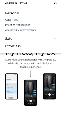
Adding more interactive videos:
While Motorola did provide the gifs for the Gestures part, most of the animations and videos were done using AfterEffects; I had such a fun time learning to make short animations like these;
2. Having an in-page navigation:

3. Having pop-ups for extra information:


Team Feedback:
After a review of the usability test, we received some suggestions from the Product Marketing team:
Before:

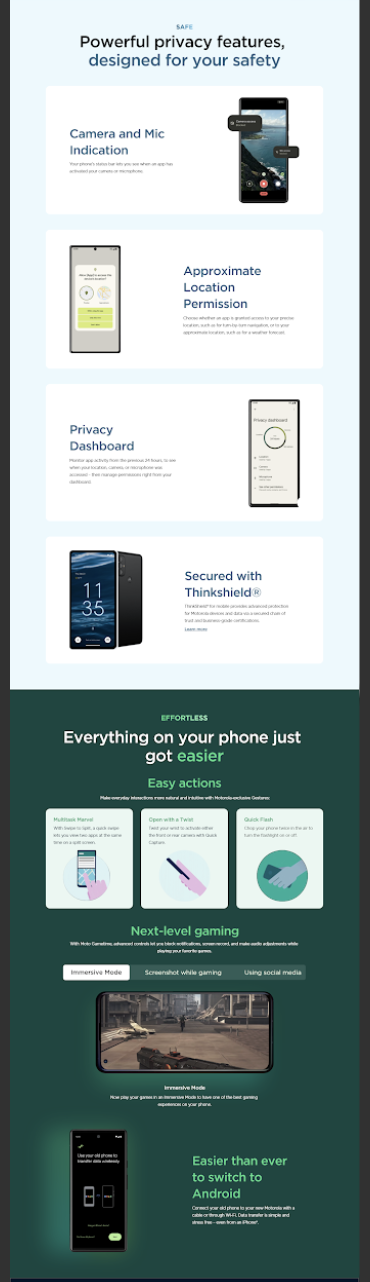
To highlight more of what MyUX uniquely has to offer to users, the Gestures makes them stand out from the competitors, therefore, I switched ‘Effortless’ and ‘Safe’; and also added the background corresponding to the colours which made these features ‘pop’ so that users feel drawn into the experience of seeing these features in action.
After:
Final iterations:


Color me this: This was one of the first projects where I got to work across teams and departments, receive feedback from different perspectives and really experienced the complexities of designing in a multi-faceted organisation. There are so many things I wish I did differently but looking back, this was genuinely the best work I think I could have done; I would have tried to document my design decisions better, tried to see how this page fit in with the larger systems, and seen if it could really be the adaptable template I wanted it to be. This was also my first time using Adobe and AfterEffects gave me one heck of a time!